rm(list = ls())

if (!require(pacman)) install.packages("pacman")
pacman::p_load(tidyverse, rstatix, ggpubr, agricolae, tinytable, rempsyc,
knitr, kableExtra, ggstatsplot, papaja, janitor, apa)4 Zwei-Wege-ANOVA-Modellen
Dies ist eine Übung, bei der Datenmanagement mit den dplyr-Funktionen pivot_longer, rename und bind_rows geübt wird. Außerdem zeige ich, wie eine ANOVA-Analyse mit R durchgeführt und in Quarto veranschaulicht werden kann. Dabei beziehe ich mich auf den Inhalt von Childs et al. (2021, Kapitel 27).
Unser Ziel ist es, zu lernen, wie man mit Zwei-Wege-ANOVA-Modellen in R arbeitet, anhand eines Beispiels aus einem Pflanzenwettbewerbsexperiment. Der Arbeitsablauf ist sehr ähnlich wie bei der Einweg-ANOVA in R. Wir beginnen mit dem Problem und den Daten und arbeiten dann durch die Modellanpassung, die Bewertung der Annahmen, den Signifikanztest und schließlich die Darstellung der Ergebnisse.
4.1 R-Sitzung einrichten
4.2 Daten einlesen
Pflanzen haben einen optimalen Boden-pH-Wert für ihr Wachstum, und dieser variiert zwischen den Arten. Folglich würden wir erwarten, dass wenn wir zwei Pflanzen im Wettbewerb zueinander unter verschiedenen pH-Werten anbauen, der Effekt des Wettbewerbs je nach Boden-pH-Wert unterschiedlich ausfallen könnte. In einer aktuellen Studie wurde das Wachstum des Grases Festuca ovina (Schaf-Schwingel) im Wettbewerb mit der Besenheide Calluna vulgaris (Heidekraut) in Böden mit unterschiedlichen pH-Werten untersucht. Calluna ist gut angepasst, auf sehr sauren Böden wie dem Millstone Grit und den Hochmoorflächen um Sheffield zu wachsen. Festuca wächst auf Böden mit einem viel breiteren pH-Bereich. Wir könnten die Hypothese aufstellen, dass Calluna in sehr sauren Böden ein besserer Konkurrent von Festuca sein wird als in mäßig sauren Böden. Hier sind die Daten: Die Spalten pH 3.5 und pH 5.5 enthalten das Gewicht, die Spalte Condition enthält die Anwesenheit oder Abwesenheit von Calluna.
Dies ist ein vollständig faktorielles Zwei-Wege-Design. Die Gesamtanzahl der unterschiedlichen Behandlungsgruppen beträgt \(2 \times 2 = 4\). Für jede der Behandlungen gab es 5 Messwerte bzw. Pflanzen, was insgesamt \(2 \times 2 \times 5 = 20\) Beobachtungen ergibt. Hier sind die vorliegenden Daten:
data_present <- data.frame(
  Condition = rep(c("Calluna Present"), each = 5),
  `ph_3_5` = c(2.76, 2.39, 3.54, 3.71, 2.49),
  `ph_5_5` = c(3.21, 4.10, 3.04, 4.13, 5.21),
  check.names = FALSE
)
data_present
Condition ph_3_5 ph_5_5
1 Calluna Present 2.76 3.21
2 Calluna Present 2.39 4.10
3 Calluna Present 3.54 3.04
4 Calluna Present 3.71 4.13
5 Calluna Present 2.49 5.21data_absent <- data.frame(
Condition = rep(c("Calluna Absent"), each = 5),
`ph_3_5`= c(4.10, 2.72, 2.28, 4.43, 3.31),
`ph_5_5` = c(5.92, 7.31, 6.10, 5.25, 7.45),
check.names = FALSE
)
data_absent Condition ph_3_5 ph_5_5
1 Calluna Absent 4.10 5.92
2 Calluna Absent 2.72 7.31
3 Calluna Absent 2.28 6.10
4 Calluna Absent 4.43 5.25
5 Calluna Absent 3.31 7.45Um diese zwei Datensätze zu kombinieren, verwende ich die Funktion bind_rows (siehe R Dokumentation):
data <- bind_rows(data_present, data_absent)
data
Condition ph_3_5 ph_5_5
1 Calluna Present 2.76 3.21
2 Calluna Present 2.39 4.10
3 Calluna Present 3.54 3.04
4 Calluna Present 3.71 4.13
5 Calluna Present 2.49 5.21
6 Calluna Absent 4.10 5.92
7 Calluna Absent 2.72 7.31
8 Calluna Absent 2.28 6.10
9 Calluna Absent 4.43 5.25
10 Calluna Absent 3.31 7.45Um diesen Datensatz nun im sogenannten Long-Format darzustellen, verwende ich die Funktion pivot_longer. Dieses Format hat bei der Verwendung einiger Befehle vorteile. Wie zwischen dem Long-Format und den Wide-Format gewechselt werden kann, bitte ich Wickham & Grolemund (2023): 5.3 Lengthening data zu entnehmen.
Wickham, H., & Grolemund, G. (2023). R for Data Science (2e). https://r4ds.hadley.nz/
festuca <- data |>
  pivot_longer(cols = starts_with("pH"), names_to = "ph", values_to = "weight") |>
  rename(calluna = Condition) |>
  mutate(across(c(calluna, ph), as.factor))

festuca
# A tibble: 20 × 3
calluna ph weight
<fct> <fct> <dbl>
1 Calluna Present ph_3_5 2.76
2 Calluna Present ph_5_5 3.21
3 Calluna Present ph_3_5 2.39
4 Calluna Present ph_5_5 4.1
5 Calluna Present ph_3_5 3.54
6 Calluna Present ph_5_5 3.04
7 Calluna Present ph_3_5 3.71
8 Calluna Present ph_5_5 4.13
9 Calluna Present ph_3_5 2.49
10 Calluna Present ph_5_5 5.21
11 Calluna Absent ph_3_5 4.1
12 Calluna Absent ph_5_5 5.92
13 Calluna Absent ph_3_5 2.72
14 Calluna Absent ph_5_5 7.31
15 Calluna Absent ph_3_5 2.28
16 Calluna Absent ph_5_5 6.1
17 Calluna Absent ph_3_5 4.43
18 Calluna Absent ph_5_5 5.25
19 Calluna Absent ph_3_5 3.31
20 Calluna Absent ph_5_5 7.454.3 Deskriptive Statistik
Um Aussagen über die Beziehung des pH-Werts mit der Pflanzenart tätigen zu können, sollte zunächst ein deskriptiver Blick auf die Daten getätigt werden. Lassen Sie uns also auf den Mittelwert und die Standardabweichung der vier Gruppen blicken. Dies kann tabellarisch oder grafisch geschehen.
4.3.1 Tabellarisch
Dies geht flexibel mit den Funktionen group_by in Kombination mit summarize:
summary_stats <- festuca |>
  group_by(calluna, ph) |>
  summarize(
    mean = mean(weight),
    sd = sd(weight)
  ) |>
  ungroup()

summary_stats
# A tibble: 4 × 4
calluna ph mean sd
<fct> <fct> <dbl> <dbl>
1 Calluna Absent ph_3_5 3.37 0.904
2 Calluna Absent ph_5_5 6.41 0.945
3 Calluna Present ph_3_5 2.98 0.609
4 Calluna Present ph_5_5 3.94 0.869Wenn wir schließlich eine publikationswürdige Tabelle haben wollen, geht das wie folgt:
```{r  , echo=FALSE, warning=FALSE, message=FALSE}
#| label: tbl-desc_calluna
#| tbl-cap: Deskriptive Statistiken
#| tbl.align: left

summary_stats |>
  kable()
```
Das Ergebnis, ist in Tabelle 4.1 zu sehen.
| calluna | ph | mean | sd |
|---|---|---|---|
| Calluna Absent | ph_3_5 | 3.368 | 0.9042511 |
| Calluna Absent | ph_5_5 | 6.406 | 0.9451614 |
| Calluna Present | ph_3_5 | 2.978 | 0.6089089 |
| Calluna Present | ph_5_5 | 3.938 | 0.8685448 |
4.3.2 Grafisch
Boxplots bieten einen guten Einblick in die Häufigkeitsverteilung, ohne die Grafik zu überfrachten. Bei wenigen Beobachtungen, wie in unserem Fall, können sie aber problematisch sein da die Datengrundlage (5 Beobachtungen pro Boxplot) nicht ersichtlich ist, siehe Abbildung 4.1.
ggplot(data = festuca, aes(x = calluna, y = weight, colour = ph)) +
  geom_boxplot()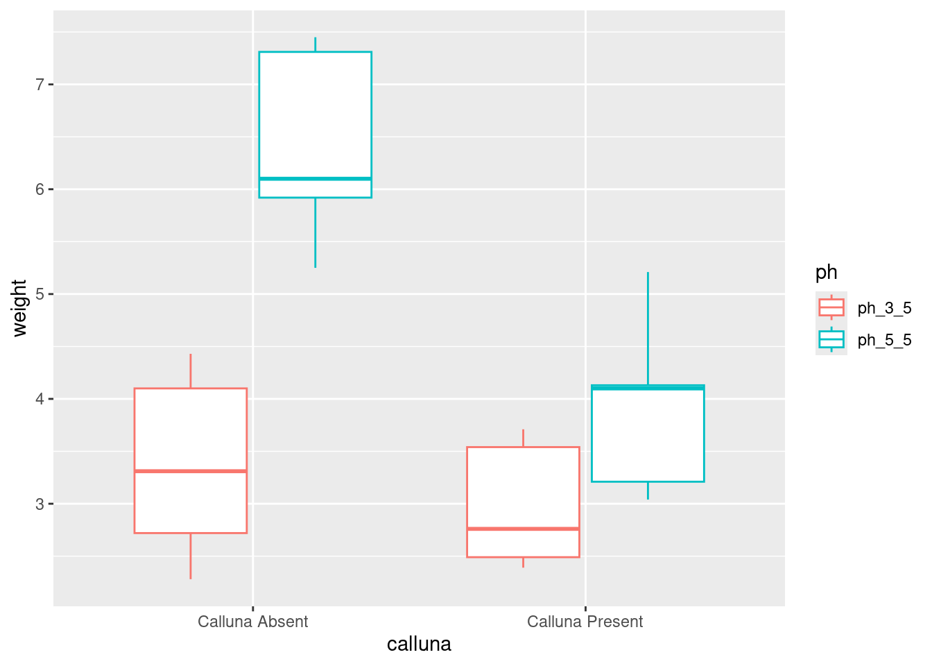
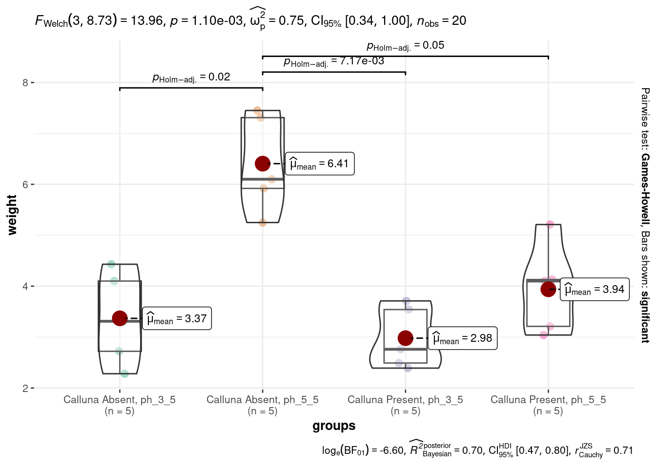
Mit der Funktion ggbetweenstats aus dem Paket ggstatsplot können die einzelnen Beobachtungen und die statistischen Test zu den Mittelwertvergleichen angezeigt werden, siehe Abbildung 4.2.
festuca_group <- festuca |>
  mutate(groups = paste(calluna, ph, sep = ", "))

plt <- ggbetweenstats(
  data = festuca_group,
  x = groups,
  y = weight
)

pltggbetweenstats
4.4 t-Test
4.4.1 One Sample t-test
t.test(festuca$weight, mu = 4)
    One Sample t-test

data:  festuca$weight
t = 0.49085, df = 19, p-value = 0.6292
alternative hypothesis: true mean is not equal to 4
95 percent confidence interval:
 3.436939 4.908061
sample estimates:
mean of x
4.1725 t.test(festuca$weight, mu = 1)
    One Sample t-test

data:  festuca$weight
t = 9.0273, df = 19, p-value = 2.664e-08
alternative hypothesis: true mean is not equal to 1
95 percent confidence interval:
 3.436939 4.908061
sample estimates:
mean of x
   4.1725
4.4.2 Two sided t-test
t.test(data$ph_3_5, data$ph_5_5, paired = FALSE)
    Welch Two Sample t-test

data:  data$ph_3_5 and data$ph_5_5
t = -3.6529, df = 13.013, p-value = 0.002917
alternative hypothesis: true difference in means is not equal to 0
95 percent confidence interval:
 -3.1811156 -0.8168844
sample estimates:
mean of x mean of y
3.173 5.172 t.test(data_absent$ph_3_5, data_absent$ph_5_5, paired = FALSE)
    Welch Two Sample t-test

data:  data_absent$ph_3_5 and data_absent$ph_5_5
t = -5.1934, df = 7.9844, p-value = 0.0008343
alternative hypothesis: true difference in means is not equal to 0
95 percent confidence interval:
 -4.387422 -1.688578
sample estimates:
mean of x mean of y
3.368 6.406 t.test(data_present$ph_3_5, data_present$ph_5_5, paired = FALSE)
    Welch Two Sample t-test

data:  data_present$ph_3_5 and data_present$ph_5_5
t = -2.0237, df = 7.1669, p-value = 0.08173
alternative hypothesis: true difference in means is not equal to 0
95 percent confidence interval:
 -2.0764347  0.1564347
sample estimates:
mean of x mean of y
2.978 3.938 t.test(data_absent$ph_3_5, data_present$ph_5_5, paired = FALSE)
    Welch Two Sample t-test

data:  data_absent$ph_3_5 and data_present$ph_5_5
t = -1.0165, df = 7.9871, p-value = 0.3392
alternative hypothesis: true difference in means is not equal to 0
95 percent confidence interval:
 -1.8633899  0.7233899
sample estimates:
mean of x mean of y
3.368 3.938 t.test(data_present$ph_3_5, data_absent$ph_5_5, paired = FALSE)
    Welch Two Sample t-test

data:  data_present$ph_3_5 and data_absent$ph_5_5
t = -6.8177, df = 6.8324, p-value = 0.0002776
alternative hypothesis: true difference in means is not equal to 0
95 percent confidence interval:
 -4.622899 -2.233101
sample estimates:
mean of x mean of y
2.978 6.406 t.test(weight ~ ph, data = festuca)
    Welch Two Sample t-test

data:  weight by ph
t = -3.6529, df = 13.013, p-value = 0.002917
alternative hypothesis: true difference in means between group ph_3_5 and group ph_5_5 is not equal to 0
95 percent confidence interval:
 -3.1811156 -0.8168844
sample estimates:
mean in group ph_3_5 mean in group ph_5_5
3.173 5.172 t.test(weight ~ calluna, data = festuca)
    Welch Two Sample t-test

data:  weight by calluna
t = 2.2371, df = 12.893, p-value = 0.04359
alternative hypothesis: true difference in means between group Calluna Absent and group Calluna Present is not equal to 0
95 percent confidence interval:
 0.04785705 2.81014295
sample estimates:
 mean in group Calluna Absent mean in group Calluna Present
                        4.887                         3.458
4.5 ANOVA
Verwenden Sie dieses Modell, um die ANOVA zu berechnen: weight ~ ph + calluna + ph:calluna
festuca_model <- aov(weight ~ ph + calluna + ph:calluna, data = festuca)
anova(festuca_model)
Analysis of Variance Table
Response: weight
Df Sum Sq Mean Sq F value Pr(>F)
ph 1 19.9800 19.9800 28.1792 7.065e-05 ***
calluna 1 10.2102 10.2102 14.4001 0.00159 **
ph:calluna 1 5.3976 5.3976 7.6126 0.01397 *
Residuals 16 11.3446 0.7090
---
Signif. codes: 0 '***' 0.001 '**' 0.01 '*' 0.05 '.' 0.1 ' ' 1Diese Ergebnis können publikationswürdig mit den Funktionen apa_print aus dem Paket papaja und kable dargestellt werden, siehe Tabelle 4.2:
```{r, echo=FALSE, eval=TRUE, message=FALSE, warning=FALSE}
#| label: tbl-festuca_model
#| tbl-cap: "ANOVA Ergebnisse"

apa_anova <- apa_print(festuca_model)
knitr::kable( apa_anova$table, booktabs=T)
``` Effect
1 (Intercept) F(1, 16) = 491.08, p < .001, petasq = .97 ***
2 ph F(1, 16) = 28.18, p < .001, petasq = .64 ***
3 calluna F(1, 16) = 14.40, p = .002, petasq = .47 **
4 ph:calluna F(1, 16) = 7.61, p = .014, petasq = .32 * 4.6 Diagnostics
Lesen Sie Childs et al. (2021): 27.5 Diagnostics. Außerdem ist diese Seite einen Blick wert. Dort finden Sie einige für die ANOVA-Diagnostik hilfreiche R-Funktionen.
4.7 Interaktions Diagramm
Ein Interaktionsdiagramm illustriert, wie zwei oder mehr unabhängige Variablen gemeinsam die abhängige Variable beeinflussen. Es hilft dabei, Wechselwirkungen zwischen Faktoren visuell darzustellen und besser zu verstehen, ob der Effekt einer unabhängigen Variablen von der Ausprägung einer anderen abhängt. Dies ist besonders wichtig, um mögliche Interaktionen identifizieren und interpretieren zu können, die in einer ANOVA-Analyse auftreten.
So ein Diagramm kann mit der Funktion interaction.plot erstellt werden:
interaction.plot(festuca$ph, festuca$calluna, response = festuca$weight)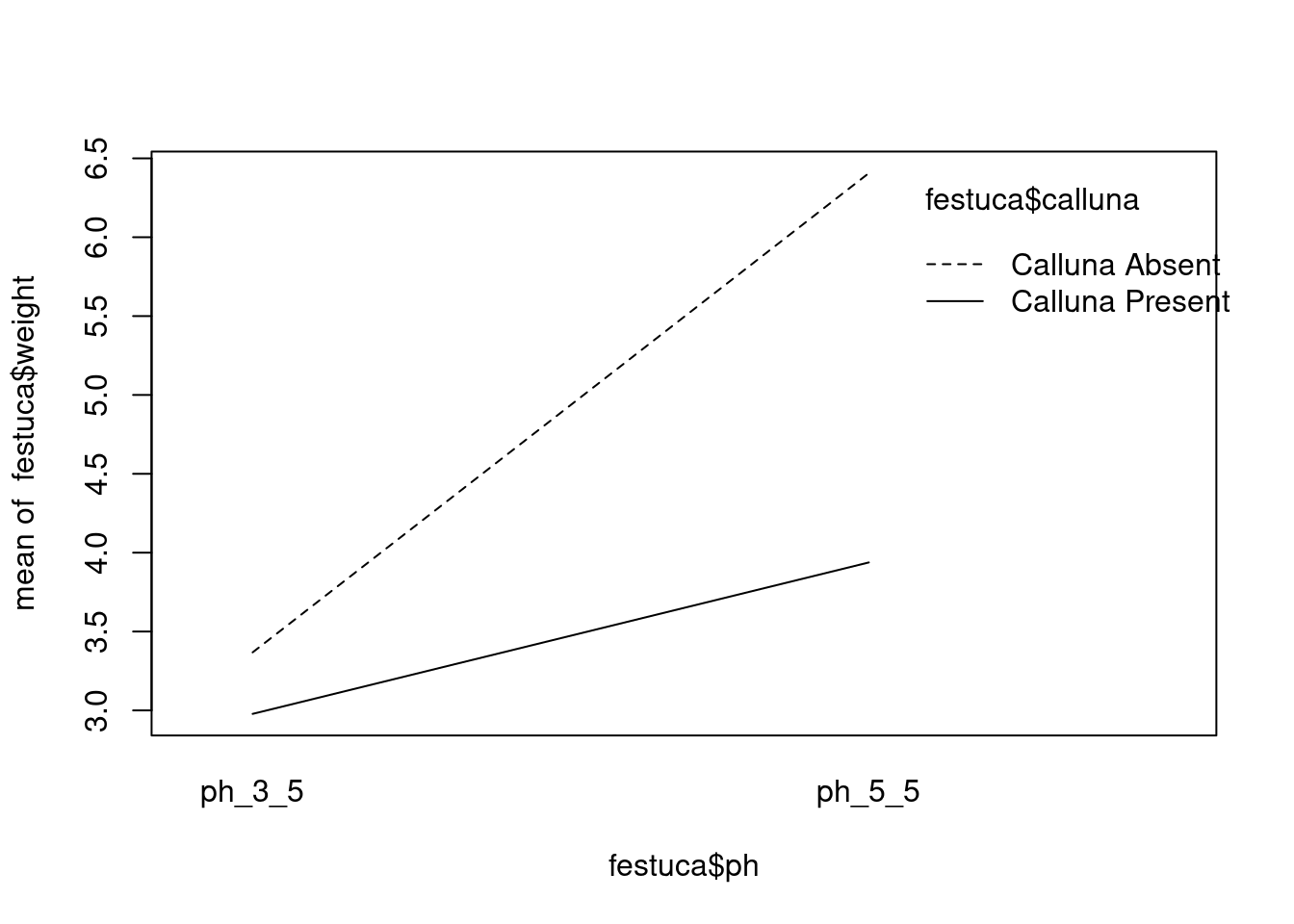
Hier ist eine viel ansprechendere und flexiblere Methode, um Interaktionsdiagramme mithilfe der tidyverse-Funktionen zu erstellen:
# step 1. calculate means for each treatment combination
festuca_means <-
  festuca |>
  group_by(calluna, ph) |>  # <- remember to group by *both* factors
  summarise(Means = mean(weight))
# step 2. plot these as an interaction plot
ggplot(festuca_means,
aes(x = ph, y = Means, colour = calluna, group = calluna)) +
geom_point(size = 4) + geom_line()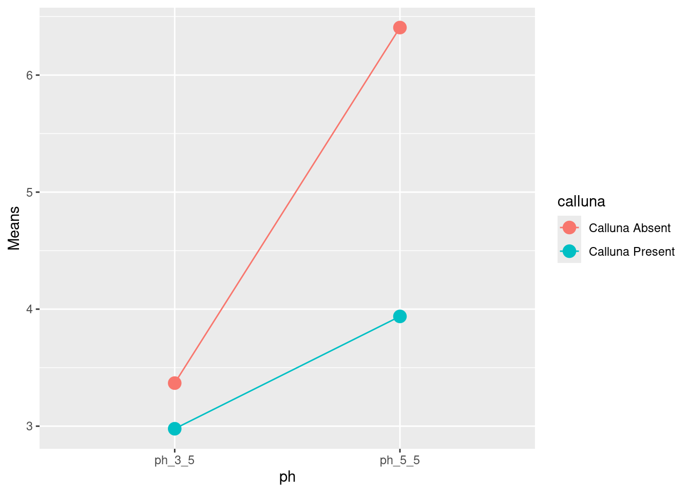
Bitte lesen Sie Childs et al. (2021): 27.6.1 und berücksichtigen Sie Abbildung 4.3.
Childs, D. Z., Hindle, B. J., & Warren, P. H. (2021). APS 240: Data Analysis and Statistics with R. online. https://dzchilds.github.io/stats-for-bio

4.8 Multiple-Vergleichs-Test
Ein Multiple-Vergleichs-Test, wie der TukeyHSD-Test, wird verwendet, um nach einer ANOVA-Analyse die Unterschiede zwischen den Gruppenpaaren genauer zu untersuchen. Er hilft dabei, festzustellen, welche spezifischen Gruppen sich signifikant voneinander unterscheiden, indem er alle möglichen Paarvergleiche berücksichtigt. Dies ist besonders nützlich, um nach signifikanten Ergebnissen aus der ANOVA detailliertere Erkenntnisse zu gewinnen.
TukeyHSD(festuca_model, which = 'ph:calluna') Tukey multiple comparisons of means
95% family-wise confidence level
Fit: aov(formula = weight ~ ph + calluna + ph:calluna, data = festuca)
$`ph:calluna`
diff lwr upr
ph_5_5:Calluna Absent-ph_3_5:Calluna Absent 3.038 1.5143518 4.5616482
ph_3_5:Calluna Present-ph_3_5:Calluna Absent -0.390 -1.9136482 1.1336482
ph_5_5:Calluna Present-ph_3_5:Calluna Absent 0.570 -0.9536482 2.0936482
ph_3_5:Calluna Present-ph_5_5:Calluna Absent -3.428 -4.9516482 -1.9043518
ph_5_5:Calluna Present-ph_5_5:Calluna Absent -2.468 -3.9916482 -0.9443518
ph_5_5:Calluna Present-ph_3_5:Calluna Present 0.960 -0.5636482 2.4836482
p adj
ph_5_5:Calluna Absent-ph_3_5:Calluna Absent 0.0001731
ph_3_5:Calluna Present-ph_3_5:Calluna Absent 0.8826936
ph_5_5:Calluna Present-ph_3_5:Calluna Absent 0.7117913
ph_3_5:Calluna Present-ph_5_5:Calluna Absent 0.0000443
ph_5_5:Calluna Present-ph_5_5:Calluna Absent 0.0014155
ph_5_5:Calluna Present-ph_3_5:Calluna Present 0.3079685HSD.test(festuca_model, trt = c("ph", "calluna"), console = TRUE)
Study: festuca_model ~ c("ph", "calluna")

HSD Test for weight

Mean Square Error:  0.709035

ph:calluna,  means

                       weight       std r        se  Min  Max  Q25  Q50  Q75
ph_3_5:Calluna Absent   3.368 0.9042511 5 0.3765727 2.28 4.43 2.72 3.31 4.10
ph_3_5:Calluna Present  2.978 0.6089089 5 0.3765727 2.39 3.71 2.49 2.76 3.54
ph_5_5:Calluna Absent   6.406 0.9451614 5 0.3765727 5.25 7.45 5.92 6.10 7.31
ph_5_5:Calluna Present  3.938 0.8685448 5 0.3765727 3.04 5.21 3.21 4.10 4.13

Alpha: 0.05 ; DF Error: 16
Critical Value of Studentized Range: 4.046093

Minimun Significant Difference: 1.523648

Treatments with the same letter are not significantly different.

                       weight groups
ph_5_5:Calluna Absent   6.406      a
ph_5_5:Calluna Present  3.938      b
ph_3_5:Calluna Absent   3.368      b
ph_3_5:Calluna Present  2.978      b
4.9 Schlussfolgerungen ziehen und Ergebnisse präsentieren
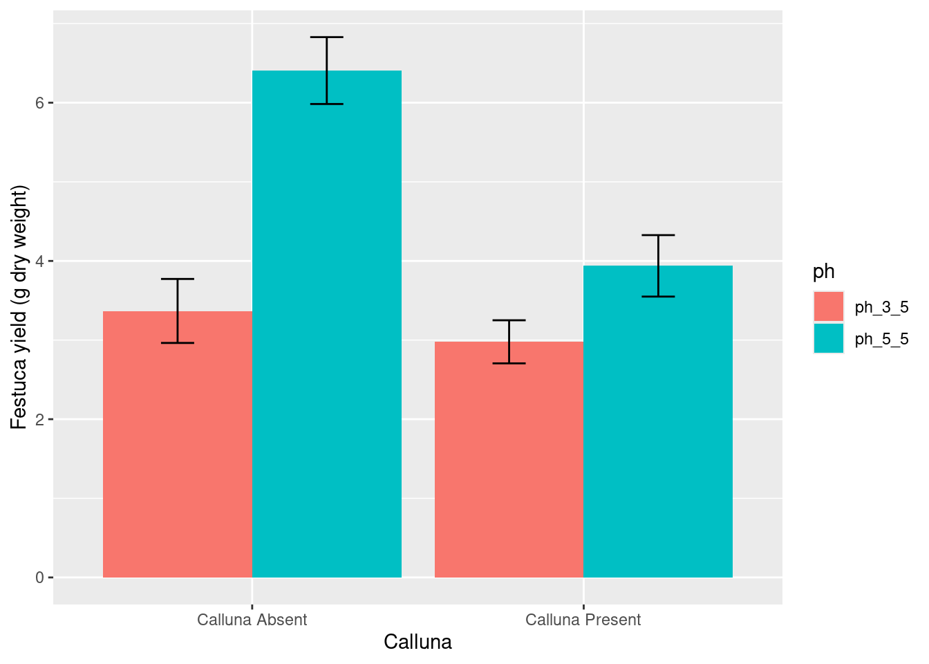
Hier sind einige Code-Beispiele, wie die oben gezeigten Diagramme viel schöner gestaltet werden könnten.
# step 1. calculate means for each treatment combination
festuca_stats <-
  festuca |>
  group_by(calluna, ph) %>% # <- remember to group by the two factors
  summarise(means = mean(weight), SEs = sd(weight)/sqrt(n()))
`summarise()` has grouped output by 'calluna'. You can override using the
`.groups` argument.# step 1. calculate means for each treatment combination
festuca_stats <-
festuca |>
group_by(calluna, ph) %>% # <- remember to group by the two factors
summarise(means = mean(weight), ses = sd(weight)/sqrt(n()))# step 2. plot these as an interaction plot
ggplot(festuca_stats,
aes(x = calluna, y = means, colour = ph,
ymin = means - ses, ymax = means + ses)) +
# this adds the mean
geom_point(size = 3) +
# this adds the error bars
geom_errorbar(width = 0.1) +
# controlling the appearance
scale_y_continuous(limits = c(2, 7)) +
xlab("Calluna") + ylab("Festuca yield (g dry weight)") +
# use a more professional theme
theme_bw()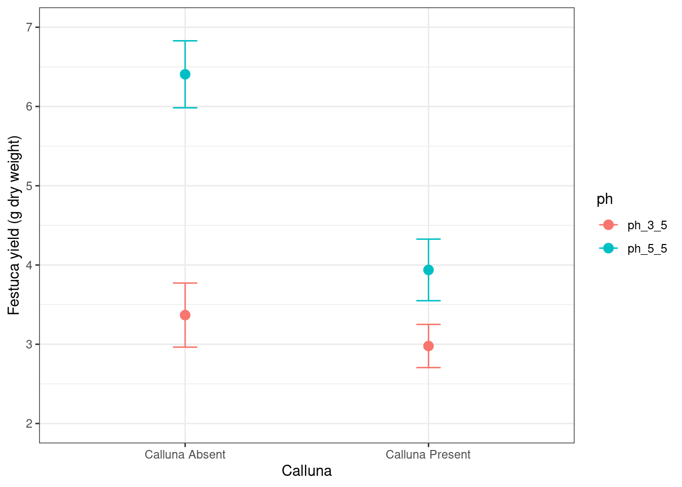
# define a position adjustment
pos <- position_dodge(0.15)
# make the plot
ggplot(festuca_stats,
       aes(x = calluna, y = means, colour = ph,
           ymin = means - ses, ymax = means + ses)) +
  # this adds the mean (shift positions with 'position =')
  geom_point(size = 3, position = pos) +
  # this adds the error bars (shift positions with 'position =')
  geom_errorbar(width = 0.1, position = pos) +
  # controlling the appearance
  scale_y_continuous(limits = c(2, 7)) +
  xlab("Calluna") + ylab("Festuca yield (g dry weight)") +
  # use a more professional theme
  theme_bw()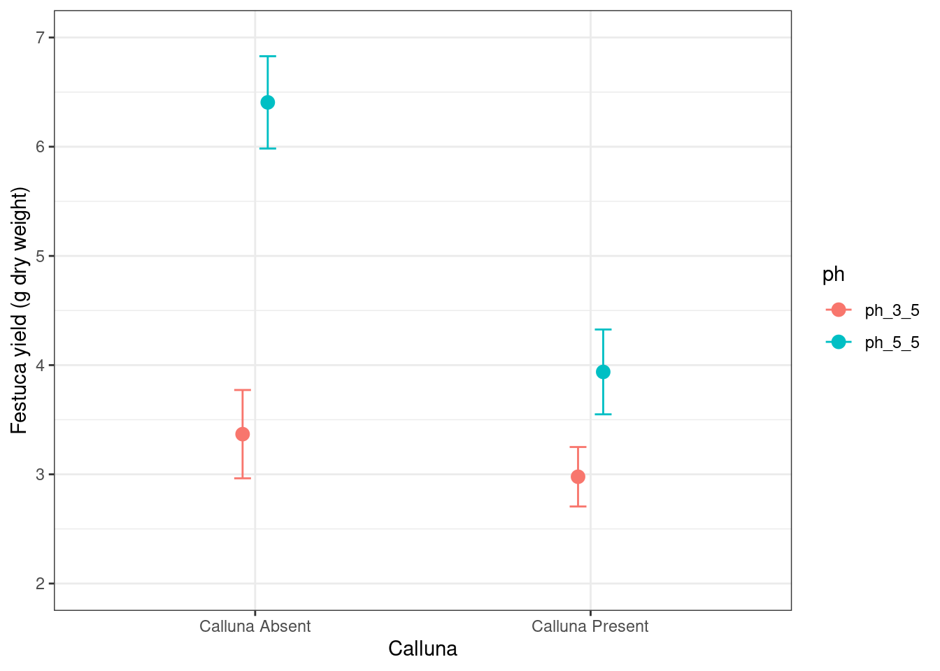
ggplot(festuca_stats,
       aes(x = calluna, y = means, fill = ph,
           ymin = means - ses, ymax = means + ses)) +
  # this adds the mean
  geom_col(position = position_dodge()) +
  # this adds the error bars
  geom_errorbar(position = position_dodge(0.9), width=.2) +
  # controlling the appearance
  xlab("Calluna") + ylab("Festuca yield (g dry weight)")