8 Visualize data
Data visualization is an art. The purposes of visualizing data are manifold. You can emphasize facts, get known to data, detect anomalies, and communicate a large amount of information simply and intuitive. Whatever your goal is, thousand of appropriate ways exist to visualize data. Many decisions to take are simply a matter of taste. However, there are some conventions and guidelines that help you to make on average better decisions when designing a visualization:
- Good graphs are easy to understand and eye catching.
- Graphs can be misleading and manipulative and that is opposing to the ideas of science. Thus, be responsible and honest.
- Minimize colors and other attention-grabbing elements that are not directly related to the data of interest. Worldwide, there are approximately 300 million color blind people. In particular, red, green or blue light are problematic to color blind people. Thus, better rely on color schemes that are designed for colorblind people.
- Don’t truncate an axis or change the scaling within an axis just to make you your story more appealing. Show the full scale of the graph, then zoom to show the data of interest, if necessary.
- Label and describe your chart sufficiently so that everybody can fully understand the content of the shown data set and statistics without having to study the notes of the graph for too long.
- Don’t do pie charts. They may look simple, but they’re tricky to get right and there are usually better alternatives. Humans are not very good at comparing the size of angles and as there’s no scale in pie plots, reading accurate values is difficult. Figure Figure 8.1 may proof this.
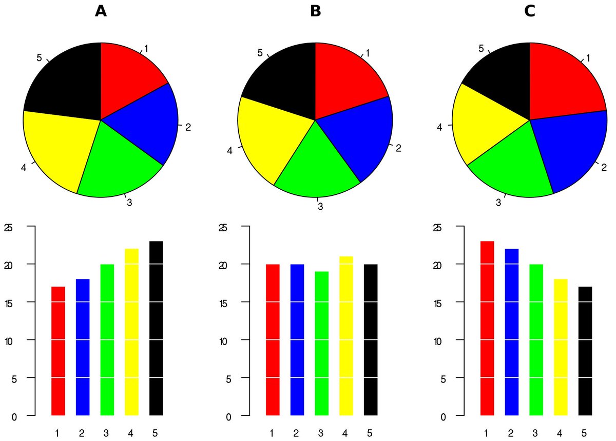
Source: https://en.wikipedia.org/wiki/Pie_chart
- Data Visualization: Chart Dos and Don’ts (by Duke University)
- Graphs and Visualising Data by Oliver Kirchkamp. In particular, I highly recommend his handout (Kirchkamp, 2018). It discusses many pitfalls of visualizing data, instructs how to do good graphs, and he shows the corresponding R code of all graphs.
- The From Data to Viz website leads you to the most appropriate graph for your data. It links to the code to build it and lists common caveats you should avoid.
- The R Graph Gallery and R CHARTS by R CODER shows graphs and the corresponding R code to replicate the graphs
- The work of Edward Tufte and his book The Visual Display of Quantitative Information (Tufte, 2022) are classical readings.
A great resource to learn how to visualize data is Wickham & Grolemund (2023). As I cannot do that any better, I refer to that source and refrain from writing section myself. It introduces the ggplot function which is part of the ggplot2 package which, in turn, is part of the tidyverse package. Thus, if you’ve installed and loaded tidyverse, you automatically have access to ggplot. Creating beautiful and informative graphs is easy with ggplot. To proof that claim, study the chapter (Data visualization) of Wickham & Grolemund (2023). Another good resource on modern data visualization is Kabacoff (2024).